A new era for Voltfang: A modern design for a clear mission
Voltfang gets a new logo. Connecting and progressive – as an enabler of the energy transition. We keep going where others stop.
Aachen, 02 April 2025: Voltfang’s logo receives its first update since the company was founded.. What once symbolized just a battery storage unit now represents the dynamism and pioneering role of Voltfang. For five years, Voltfang has been on the market and has evolved from a provider of innovative battery storage systems into a comprehensive solution provider. This progress is reflected in the new, simplified logo. With it, Voltfang confidently shows that its visual identity is just as bold and versatile as the brand itself.
“Voltfang stands for connection. We take action where others hesitate and move forward where others are still thinking. We don’t just want to connect technologies, but bring people together. The energy transition is a topic that requires everyone to work together. It’s important to us to inspire and bring people along. This logo is the next step in Voltfang’s five-year journey and solidifies our path as an enabler of the energy transition in the German economy. Wherever energy flows, Voltfang connects,” says David Oudsendij, CEO and co-founder of Voltfang.
The new visual identity makes Voltfang’s brand more tangible across all touchpoints — whether digital or physical. It translates the vision into a holistic brand experience that is not just visible, but also palpable — through clean shapes, recognizable elements, and a clear design language.
“At Voltfang, we learned from the beginning to face problems head-on that others avoid. This mindset has guided us to this day. That’s why we’re especially pleased that the design process for our new logo was fully driven by our internal team. Unlike others who hire branding agencies, we chose to dive deep into our own identity. In a time when belonging and values are being questioned more than ever, we’ve grown even closer as a team. This awareness shapes our daily work with our customers,” says Roman Alberti, CSO and co-founder of Voltfang.
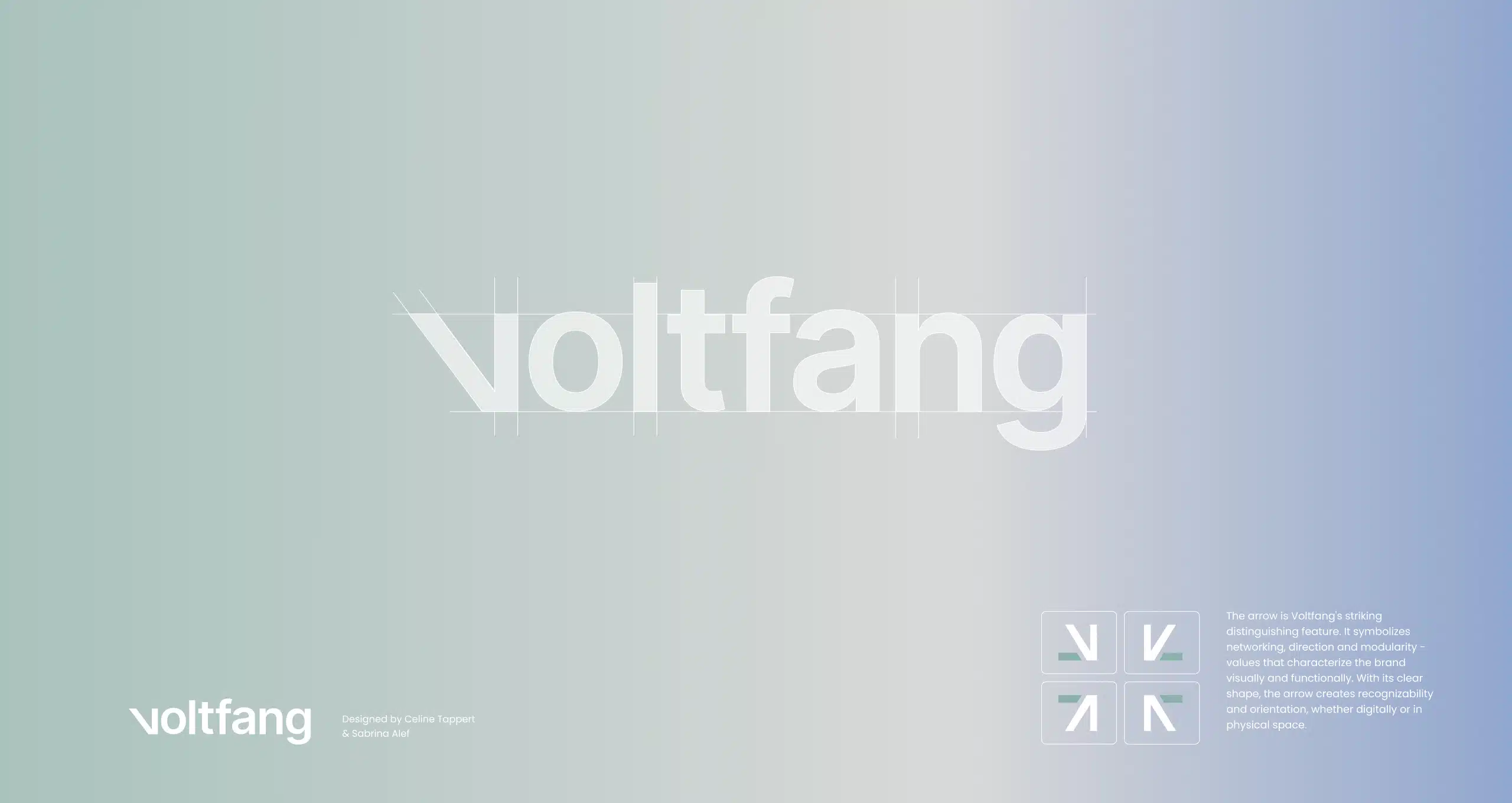
With new design elements such as the arrow, the brand becomes functional and visible. With its clean shape, the arrow provides recognizability and direction for the next innovation in the digital or physical space. Whether through scalability or integration within a network – the arrow represents efficient paths and the flexibility needed.
“Our new logo reflects the ambition we have set for ourselves: to actively shape the energy transition and present innovative solutions. As a European provider of a holistic battery storage platform, we demonstrate clear paths and a high level of responsibility. With Voltfang – and this new logo – we are both visibly and credibly standing for a lived, future-proof energy transition,” says Afshin Doostdar, CTO and co-founder of Voltfang.
Voltfang’s new logo design is part of a broader strategy that not only drives the energy transition forward but also actively rethinks and clearly communicates it.
Press
The new logo is available on the website under Press & Downloads.
For press inquiries, please contact: presse@voltfang.de